Panacea Life Sciences - Pana
The CBD industry has become a crowded place, which makes Pana a breath of fresh air. By bringing together the best of science and nature through 100% organic ingredients and rigorous scientific-based processes, their mission to Cultivate Everyday Wellness never falls short.
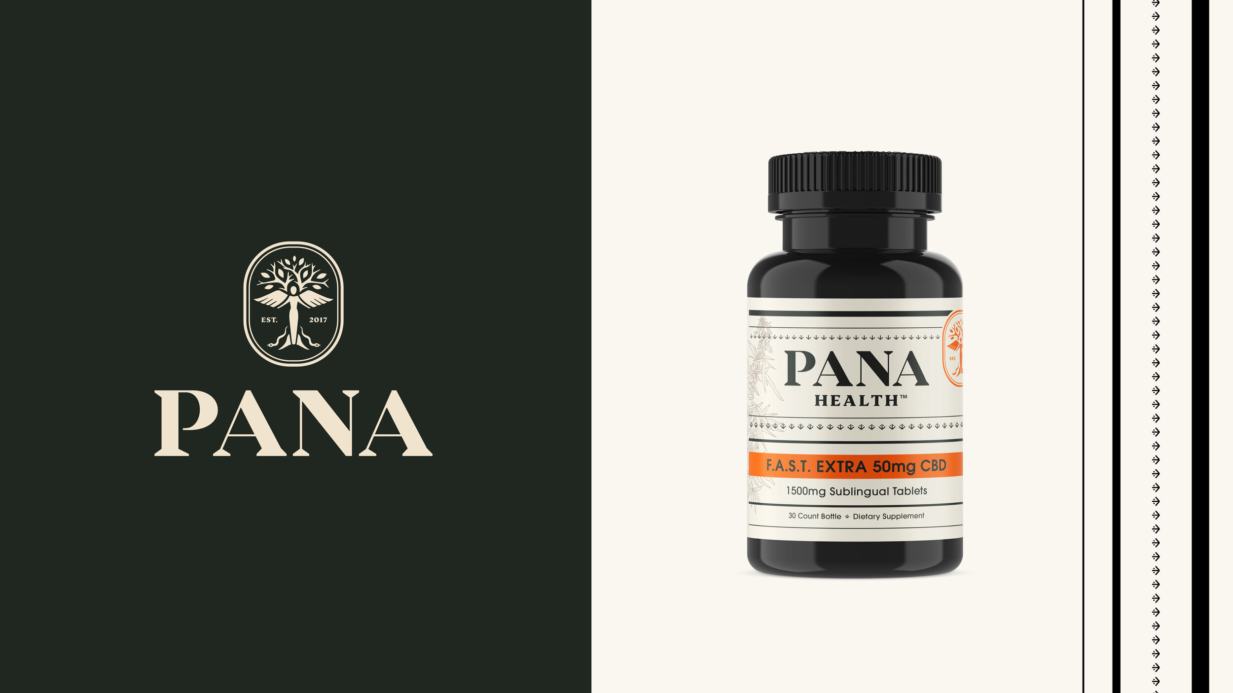
For a CBD brand this refreshing, they needed a look and feel that followed suit.
We helped Pana undergo an extensive rebranding that included a goddess logomark inspired by Panacea, the Greek goddess of healing. We also implemented new colors and graphic lines and patterns that provide a sophisticated, apothecary-esque feel to complement the brand’s natural remedies. To differentiate their product lines we brought in a hand-drawn illustration style, each illustration depicting the product line they represent.